Issuetrak 17: New UI/UX Plus Private Attachments
Several years have passed since our last major update to Issuetrak’s navigation. While Issuetrak 14 offered vast improvements, Issuetrak 17 expands on those changes and takes everything to the next level.
Issuetrak 17 brings modern refinements to navigation, both visually and functionally, ensuring you have quick access to all of Issuetrak’s staple features. In fact, we’ve made some workspaces even easier to access, helping you maximize your productivity.
Here are some highlights:
⋅ Upgraded UI/UX across the product, including a new easy-access left menu, right quick menu UI improvements, and UI/UX improvements to Projects, Billing, Events (formerly Calendar), and Email Issue.
⋅ New and Updated Features to Issuetrak 17, including Linked Attachments on Notifications, Private Attachments, and Direct Note Links.

Upgraded UI/UX Across the Product
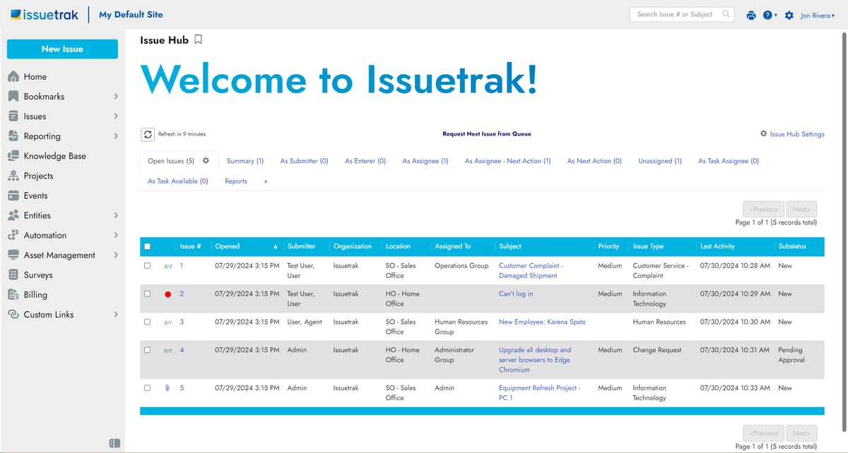
The first thing you might notice when looking at our screenshots is a brand new font. Our goal was to provide something warm, friendly, and inviting. We also added a new default color theme if you’re curious to see something a little different.
But that’s just a drop in the bucket. UI refinements were made throughout the product, including:
1. The left menu
Several releases ago, Issuetrak 14 brought many changes to the left menu - but several issues remained. First, too many workspaces in Issuetrak stayed relegated to the Settings menu. Second, the size of the icons and font were far too small, causing everything to feel cramped.
Our new left menu has bigger icons, a larger font, and makes important workspaces easily accessible. For example, certain menu items now have submenus containing links to common pages. This allows quick access to those pages without having to resort to the settings menu. There’s also a new pin/unpin mechanic that provides smoother access to the left menu without sacrificing screen real estate.
Some important notes:
- We improved navigation by moving key workspaces (like Entities, Billing, Surveys, Automation, and Asset Management) out of the Settings menu to the left menu and adding submenu options.
- The Entities submenu has three separate links for accessing users: User Summary, User Search, and User List.
- The Dashboard, Issue Hub, Issue Search, and Unassigned Issues are now contained under Issues in a submenu.
- Reporting has a submenu that now provides quick access to many reporting areas, from custom reports to saved searches.
- The Bookmarks submenu was repositioned to the top of the left menu.
While these vital areas are now easier to access, it’s important to understand that feature and workspace visibility still depend on permissions, so agents and users will only see what they should. Additionally, much like the Settings menu, links to deactivated features will show as italicized links to provide quick access for admins to activate them.
2. Settings
As we decluttered and moved key workspaces out of the Settings menu, we were able to reformat Settings with a larger font size, more clearly defined sections, and a much better level of responsiveness that helps keep sections where you expect them to be. As a bonus, Search is still present in case you need a hand finding anything.
3. The Quick Menu
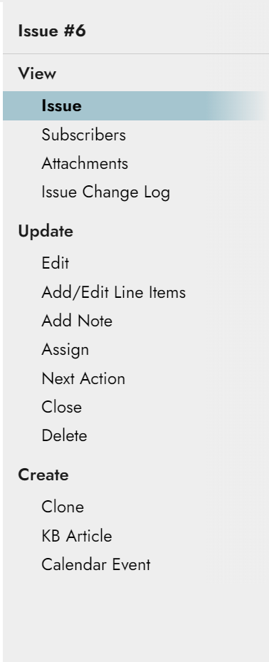
First introduced in Issuetrak 14, the quick menu on the right side of the screen was a great way for us to make context-specific options more readily available.
For Issuetrak 17, the quick menu has received larger fonts and streamlined styling that more closely resembles what we’ve done with the left menu. It’s also easier than ever to see your current location by looking for the blue highlighted text.
4. UI in Billing, Projects, and Events (formerly Calendar)
When entering Projects, Billing, or Events, you’ll be greeted with a more organized and easily digestible user interface, with all your most important information broken down into clear sections for better legibility.
And as you may have noticed, Calendar is now called Events to more accurately reflect its functionality.
-1.png?width=1200&length=1200&name=Projects%20(1)-1.png)


5. User Summary
User Summary, User Search, and User List are now accessible in the left menu under “Entities”. Within User Summary, we’ve opted for better organization with columns denoted “by Users”, “by Permissions”, and “by Authentication type”.
Additionally, you can now see a list of Currently Logged in Users in the new User Summary.

6. Email Issue
We’ve improved the email issue screen to ease the process of including attachments. Rather than a checkbox, there’s now a button and dropdown combo that allows you to insert attachment links using whichever send mode you prefer (more on send modes below). With the individual attachment links showing in the email issue body, you can even delete specific attachments you don’t want to send (pre-17 behavior forced the inclusion of all attachments).
.png?width=841&height=390&name=Email%20Issue%20(1).png)
New Features in Issuetrak 17
1. Linked Attachments
-
Plain Text: shows the filename of the attachment with no links (similar to current functionality).
- Unauthenticated: attachment names show as links within the body of the email and can be accessed by anyone without having to authenticate with your site.
- Authenticated: attachment names show as links within the body of the email and clicking one will require the recipient to log into your site first to ensure your files are protected.
As you may have noticed, none of these modes will attach files directly to issue emails and notifications. We’ve made this change to ensure your files remain secure and to ensure your notifications are sent without fear of attachment size restrictions, etc.
Important Notes about attachments:
- When it comes to unauthenticated attachment links, we’ve added an additional setting so you can specify how long those attachment links provide access to their respective files (up to 180 days). This ensures that someone looking at a three-year-old email can’t access a file that’s likely out of date.
- The attachments UI on issues is now a unified experience and is invokable using several methods. You can click the paper clip icon at the top of an issue, click the attachments label in the issue body (so long as it’s a part of your custom issue form), or click on the option in the Quick Menu. You can even drag and drop files directly onto an issue without opening the attachments window first - it will automatically open for you through the drag and drop action!
- The attachments table on either the Issue or attachments window has new icons that are both informational and actionable. Download, Delete, Block, or Privatize any attachment directly from the table. You can even preview an attachment by clicking its name.
- When emailing an issue, appropriately permissioned users can select a different attachment mode for that specific instance (public, authenticated, or plain text).
| If you’re interested in using attachment links with your site, there are a few items worth considering before making the switch. For further clarity, please consult our release notes or reach out to our support team for guidance. |
2. Private Attachments
Private Attachments is a long requested feature we’re happy to finally deliver. Before we dive into the functionality, it’s important to note that the ability to make an attachment private and to view private attachments is an Agent permission.
There are two ways to add a private attachment to an issue:
- When dragging and dropping the attachment into the attachment window, there are two possible sections to drop the file. One will attach the file as public. The smaller section on the right will attach the file as private. This is especially important for sensitive files you don’t want visible for a certain length of time.
- If you already have an existing attachment, or if you drag and drop it into the public section by mistake, you can use the new attachments table to mark it private. Simply click the open-eye icon—which will change to red and be crossed with a line—to make the file private.
- Private attachments are excluded from all send actions in the product. A properly permissioned agent must log into the product to view them.
Updated Feature: Direct Links for Notes
Ever wanted to send someone a link to a specific note on an issue or request? It’s now possible with this release. Simply open an issue, scroll down to the desired note, and click the timestamp to the left. This will copy a direct link to your clipboard to paste in an email, chat message, or wherever else you’d like.
.png?width=1200&length=1200&name=direct%20links%20(1).png)
.png?width=1200&length=1200&name=direct%20links%20copied%20(1).png)
An update you won’t want to miss
Issuetrak 17 is our largest release to-date. The UI/UX updates and additional new features all aim to improve your workflow and productivity.
And one more thing….
If you’re not an existing customer but are curious about trying Issuetrak, this latest release introduces our brand new Launch Guide, which offers a series of guided tutorials to ensure your journey with Issuetrak starts on the right foot. Directly available within the product, the Launch Guide will automatically open the first time you log into your free trial or evaluation.
Curious to see it in action and get a taste of how your own organization can benefit from software like Issuetrak? Sign up for a free trial below.
Try Issuetrak, On Us
Topics from this blog: New Release Issuetrak
Back